Here we are. Another year, another website redesign. I thought I’d be revamping it every year – new design trends and stuff. But you know what’s better than staying ‘with the times?’ Having a design that stands the test of time. BAM. Well, that’s the goal at least… let’s see what I’m feeling in a year.
Each year I look at my current, outdated website and think to myself, “WHAT was I thinking.” That’s just how it goes. I’m hoping that this design will be so ADAPTABLE, that I won’t have to overhaul it for a long, long time. It needs to be adjustable to whatever stage of life I’m in, whatever I want to showcase… whatever project I’m working on!
Just look at the last version of maikaisogawa.com :
I cry. You see, there is a fundamental issue with my website (beyond being an absolute mess). There is no purpose. Websites are stores, websites are for businesses, websites are for portfolios for people to promote one (ok maybe twooooo) things that they’re specialized in. I don’t wanna do this. One, I’m not looking for a job. Two, I felt like distilling all the stuff I like to do into one or two topics is painful. Who made up these rules anyways. That’s when I landed on my new design.
WEBSITE TOUR
This will be a very brief walk-through of where I’ll be putting stuff on my website.
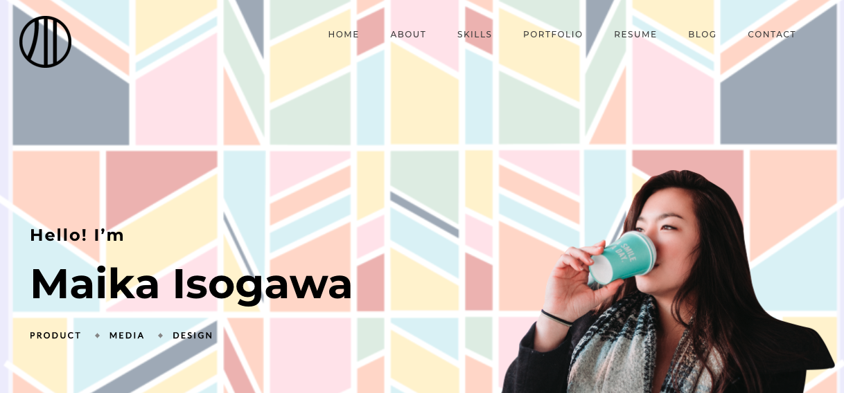
Front Page (Portfolio)
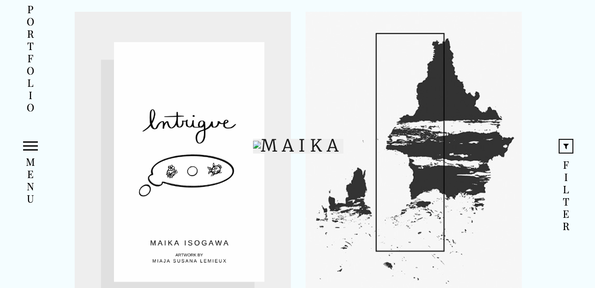
(Ignore the ugly non-image icon I’m fixing that) So this is supposed to be a ‘portfolio’ style page where someone can display their work or projects to show a potential employer, client, whatever. I’ll be using this space to just show whatever project i’m trying to highlight in the moment, since its the first thing someone sees.
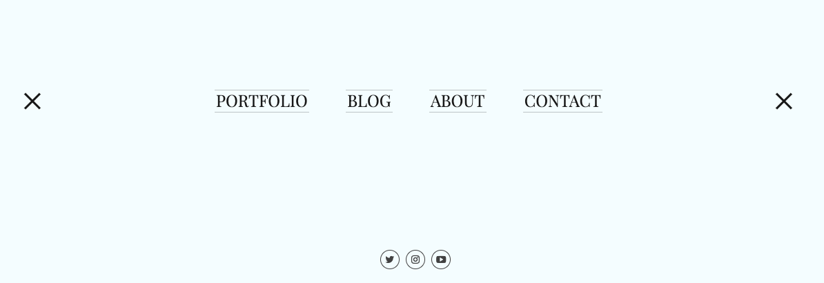
The menu bar opens up to all the options you’re going to need: Blog, About, Contact, and Projects. The projects page is just the home page. My social links are there too!
Blog Page
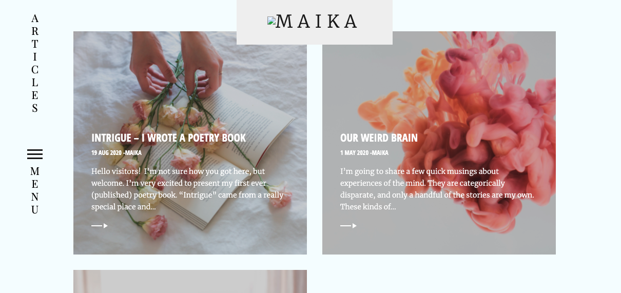
Very important…if not THE most important. This is where most of my content has been this entire time. And will continue to be the place where I share my short writings, smaller life updates, and general posts.
About Page
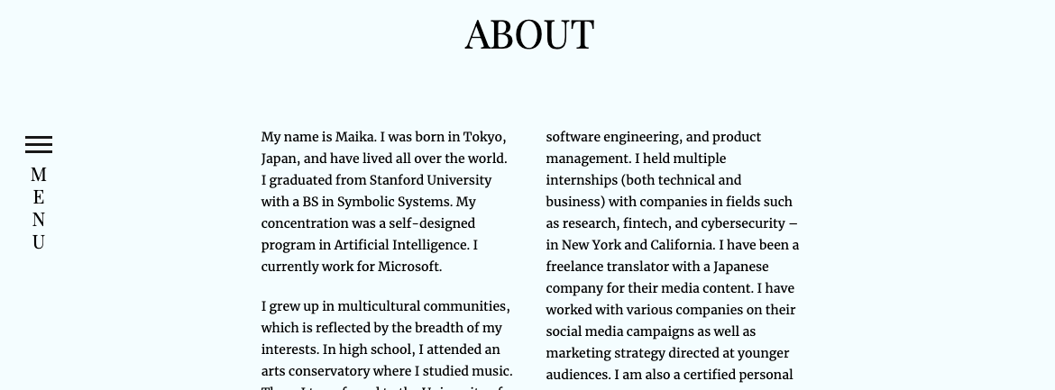
Less important but crucial. Get to know me in a little more detail since I’ve gotten rid of certain sections. I think most of the interesting stuff can be garnered from different social media sites, catered to whatever the person is searching me for. LinkedIn for professional stuff, Instagram for creative stuff, etc..
Contact Page
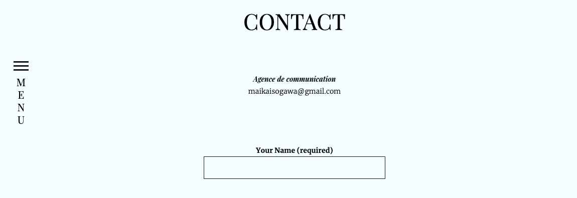
u kno wat 2 dis for.
The major change I’ve made here is taking down all of the extraneous projects that I had up on the old versions of my website. I’m not a student anymore, and a lot of those projects were school or class related, and not really in line with any direction I’m headed in now. Fun chalices in the cabinet but they can stay there in my mind out of view. My about section may list all the things I’ve dabbled in, but I think this design brings a lot more focus to the situation. More presence. Live in the nowwwwww.
kbye,
Maika